Showing posts with label colors. Show all posts

Sunday, October 21, 2018

Picture Book Review: Who Eats Orange? by Dianne White, illustrations by Robin Page

Cover image of Who Eats Orange? by Dianne White, illustrated by Robin Page
Who Eats Orange?

Colorful illustrations, rhyming text, a question and answer format—in Who Eats Orange?, a novel question is the basis for an excellent STEM readaloud. White's rhyming text easily flows from one color to another, inviting conversation around the text. A picture of a gorilla eating wild garlic, for example, answers the question, "Who eats green?" and immediately asks the question, "Who else eats green?" 
Green gorilla and giraffe spread of Who Eats Orange?
The next pages answer, "Giraffes in savannas do. Zebras. Hippos. Grunts too."
Zebra and hippo spread of Who Eats Orange?
But do grunts really eat green? "No! Grunt's don't eat green. They eat...red." This pattern continues throughout the story, introducing more animals and the foods they eat. Page's illustrations on a white background vividly depict the animals while showcasing vibrant papers and digital art techniques. The crosshatching on raccoon's face, fuzzy fur on fox's body, and marbled paint effect on finch's feathers are just a few examples.
Yellow turkey and raccoon spread of Who Eats Orange?

Fox and finch spread of Who Eats Orange?
The story concludes by moving from the animals to humans, asking if "maybe you" eat purple. "Why, yes, I do!" answers a page showing a child's hand reaching into a bowl of blueberries. The final spread depicts a colorful assortment of foods someone "just like you" might eat. 
Eat a rainbow spread of Who Eats Orange?
Two pages of back matter contain more detailed information for adults and children to further explore. The animals and food shown in the illustrations are bolded, and italicized terms are defined in the text. Who Eats Orange? is an eye-catching, entertaining introduction to colors, animals, and eating habits. 

Source: Library Copy

Further Reading:
Readalikes:
Curriculum Connections:

Sunday, October 14, 2018

Picture Book Review: Vivid: Poems & Notes About Color by Julie Paschkis

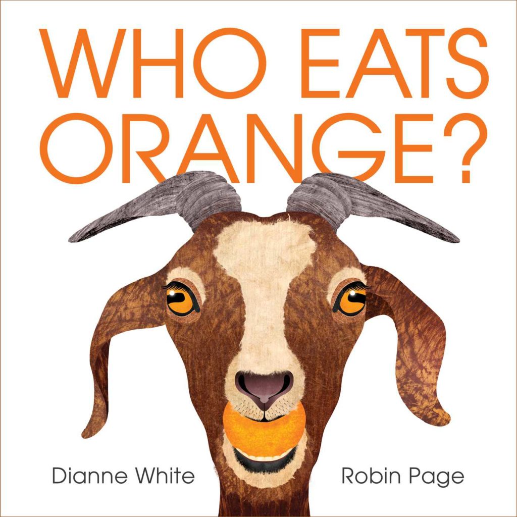
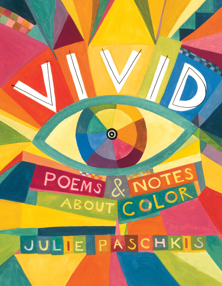
Cover image of Vivid: Poems & Notes About Color by Julie Paschkis
Vivid: Poems & Notes About Color
By Julie Paschkis
Henry Holt and Co.
2018
Ages 3-8

Conventional wisdom says that one shouldn't judge a book by its cover. In picture books, though, this aphorism is holds little value. When art and text are both essential to the reading experience, covers help establish the tone of the book and give a preview of what's inside. As soon as I saw the bright, colorful shapes and hand-lettered text on the cover of Vivid, I knew it was a book I wanted to explore.

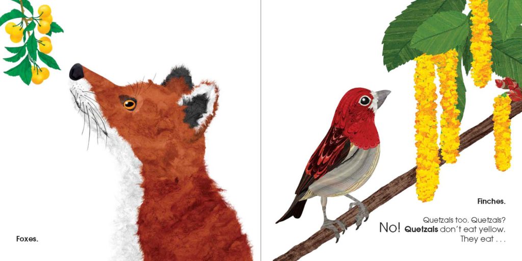
Vivid: Poems and Notes About Color is a brief collection of fourteen poems with companion informational text. Each two-page spread contains a poem and facts about the subject of the poem. The poems vary in tone, from the lilting, humorous Greens ("Eat your greens! The hungry dragon says: 'Mmm-small and scaly. I'll gobble one daily!'") 
Greens spread of Vivid: Poems & Notes About Color

to the calm, languid Indigo ("Diving into Long Lake headfirst in I go plummeting through light blue deep down low into indigo.")
Indigo spread of Vivid: Poems & Notes About Color

Text boxes present scientific, historical, artistic, and linguistic information in short asides that expand the reader's knowledge of color. Purple, for example, tells about the color's wavelength on the spectrum of visible light, the origin of purple pigment, and the reason why purple is synonymous with royalty.

Purple spread of Vivid: Poems & Notes About Color

Playful gouache illustrations reflect the text and draw the reader's eye. Purple's elegant cat wearing a crown and robe represent both the poem's "Lilac Point Siamese" and the fact that "only kings and queens could afford to wear purple." Throughout
Vivid, Paschkis skillfully weaves illustrations, poetry, and informational text into a cohesive whole that encourages discussion and exploration.

Source: Library Copy

Further Reading:
Further Listening:
In the author's note to Vivid, Paschkis writes that she hopes the book will "inspire [readers] to explore the art and science of color: to write, read, and draw a blue streak!" Educators can meet this aim by creating an interdisciplinary unit around the book. The following are examples of ways teachers could use Vivid when teaching various subjects: 
  • Science
    • Learn about light waves
    • Explore perception of color by different species
  • Language Arts
    • Study poems from Vivid and other color-themed poetry collections
    • Write a poem about a color
  • Art
    • Learn how paint pigments were originally made (cross over with science and history)
    • Define terms hue, tint, and shade and create colors
    • Create color art to complement color poem (cross over with language arts)
  • Social Studies
    • Discuss the importance of color in history (e.g. purple for royalty)
  • Music
    • Draw or paint while listening to music (cross over with art)
    • Compare colors used in drawings in small groups and discuss similarities and differences in colors chosen for a piece of music (cross over with language arts)

Friday, October 5, 2018

Picture Book Review: Green by Laura Vaccaro Seeger

Cover image of Green by Laura Vaccaro Seeger
Green
By Laura Vaccaro Seeger
A Neal Porter Book - Roaring Brook Press
2012
Ages 2-6
Lexile NP

Laura Vaccaro Seeger always knew she wanted to create picture books. As a child, she had a small shelf of book she created. Notebooks were always by her side, frequently being filled with sketches and ideas for children’s books. Being a children's book illustrator, though, was never something she seriously considered. Instead, she pursued a career in television animation, developing openings for TV shows. After her son was born, Seeger decided to step away from 80-hour work weeks and follow her first love, creating children’s books. Since then, her books have won multiple awards, including Caldecott Honors, Theodore Seuss Geisel Honors, and the Boston Globe-Horn Book Best Picture Book of 2007.

Of all Seeger's books, Green is my personal favorite. The concept of creating a book around a color is instantly appealing, and the thick layers of paint and textured paper just beg to be touched. Seeger's distinctive use of die-cuts also goes to its most complex and challenging place in this work. Green received a Caldecott Honor, and as much as I enjoy This is Not My Hat, it would have been my winner had I been on the 2013 Caldecott committee.

As with all her books, Seeger began Green with words. Most of her books are created when she and Neal Porter, her editor, look through her journal and find interesting ideas. For this one, though, Porter challenged her to write a book called green. Seeger felt overwhelmed by the possibilities of a book—would it be about the environment, recycling, a history of the earth—and almost gave up on the idea. After looking up the definition of the word, she was inspired to write a short poem, “Dark green, light green, dull green, bright green.” This poem allowed Seeger to see a new way to approach the book. She filled journal pages with words for different colors of green, searching for the best ones to convey her ideas.

Laura Vaccaro Seeger's notebook page of green words
The design challenges Seeger overcame to create this book are truly staggering. Every page contains a die-cut, so each page must integrate with those before and after it. 
On the first spread, forest green, two leaf die cuts on the recto side show a deep green.
forest green spread of Green


When the page is turned, the leaves are now on the verso side. The tree branches and ground of the first spread become two fish in the sea.
sea green spread of Green
die-cut shape in forest green and sea green spreads of Green
This process continues throughout the book. As a result, Seeger explains that “a lot of the words had to change once [she] got into painting the pictures." Some colors didn’t translate well on canvas, and other paintings weren’t able to connect with those before and after. Of the approximately 60 painting created for the book, only 16 spreads were included. These paintings compose an eye-catching concept book that depicts the color green while gently persuading the reader of the importance of preserving the natural world. 

Source: Personal Copy

Book Trailer:

Further Reading: 

Program Ideas: